Note: I haven't used Bryce in years; so these tutorials are archived "as is." I can't accept questions, because I don't remember the answers.
| RGB Spline Interpol | ||||||
| Palette | Alpha | Color | Palette | Alpha | Color | |
 |
 |
 |
 |
|||
Let's take a look at two textures, one very regular, one not, and see how the Color Modes work. If you want to follow along on your own computer, you can set up a texture similar to these, or use any texture that you like.
If you want to use these, the settings for the first one are Square noise, 1 Octave, Standard Mode, XY and YZ zero, all frequencies 100, 3D. In the first color swatch H=20, L=149, S=214. In the second one H= 170, L=127, S=255. In the third one H=255, L=127, S=255.
The second example uses Time Random noise, 5 Octaves, More Irregular Mode. XY and YZ both are zero, and all the frequencies are 143. Once again, it's a 3D noise. The color in the top swatch is H=195, L=77, S=255. In the second swatch H=179, L=155, S=252. In the bottom swatch H=211, L=220, S=240.
(Don't forget that you can get the accurate color picker that allows you to set the HSL values I've given by holding down Option/Alt when you click on the color swatch.)
When you are finished, you can return to Page 2 if desired.
| HLS Spline Interpol | |
 |
 |
You start with your choice of RGB or HLS for color space. These, of course, use either the Red, Green, and Blue values of the colors you picked, or their Hue, Lightness and Saturation. Try them both out, to see the difference. (You might want to turn the Bump off, so you can see the colors more clearly.)
Then there are the blending modes.
| Red or Hue | |
 |
|
 |
|
None is just that. It uses the color in the top swatch. Period.
Red or Hue, Green or Lightness, and Blue or Saturation map the RGB or HLS spectrum for the color in the top swatch to the alpha for that texture.
You can see what I mean by making sure you are using the RGB color space, choosing Red or Hue, holding down Option/Alt and clicking on the first color swatch. See how all the colors shown are represented in the slider for Red? Now try it with Green or Lightness, and with Blue or Saturation. The colors you see are in the Green slider, or in the Blue slider. Turn off the C for color, so you are just looking at the Alpha, and you will notice that the squares that are black here were at the left end of that slider, and the ones that are white were at the right end.
"What's the use of that?" I hear you saying. "These just look weird." And they do, when used by themselves. They were designed so that you can put the three different color channels into the three different component channels. This allows you to come up with some very neat effects. We'll be playing with it some when we get to Combining Components. (If you've already done that part, you know what I mean.)
| Linear Interpol 2 | |
 |
 |
Spline Interpol uses a spline interpolation to blend all three colors, with the top color mapped to the darkest values of the Alpha, the bottom to the lightest, and the middle to the ones in the middle. The spline makes it favor the ones in the mid range, as shown in the main lesson. It's what I used for the examples of RGB and HLS color above.
Linear Interpol 2 uses the first two colors in a straight blend. The top color is assigned to the darkest values in the Alpha map, and the middle to the lightest ones. In between, they blend. The color in the bottom swatch is completely ignored.
| Linear Interpol 3 | |
 |
 |
Linear Interpol 3 uses all three, with the top color assigned to the darkest values in the Alpha, the middle to the middle values, and the bottom swatch to the lightest values. It uses a straight linear curve to blend them, so it's the most accurate color interpretation of the Alpha channel.
| Randomized | |
 |
 |
Randomized uses all three colors in a linear blend, but adds a random RBG noise to alter the colors. The effect is that of another noise superimposed on the one you picked. It's often pretty subtle, as you can see here. It's more obvious in large blocks of solid color.
| EarthMap | |||
 |
 |
 |
 |
Earth Map add colors according to the bump map, not the alpha. The colors you have chosen are put in the middle sections of the bump. In addition, dark blue is added to the lowest areas, and white is added to the poles (highest and lowest altitude.) This one is great for planets and things like that.
| Banded | |
 |
 |
Banded uses the colors you have chosen in bands. Instead of simply using the top for the darkest values, etc., it cycles through the colors in a top-mid-bottom-mid-top pattern. What this actually looks like depends on the values you have, of course.
| Perturbed | |
 |
 |
Perturbed uses the colors you have set, but introduces irregularities into them, using a noise that Bryce generates. It's sort of like a cheap phase that you have no control over.
| Interferences | |
 |
 |
Interferences separates the Red, Green, and Blue values that are normally combined to form the first color and uses them to create a pattern that repeats around the noise. This can look like nearly anything, depending on the noise used. The colors are not directly controllable, but this can give you some great effects. (Hint, since only the first swatch is being used, you can use the Bryce color picker to run the eyedropper through the spectrum to get something more or less like the colors you are looking for. Not directly controllable, but not exactly random, either.)
| Interpol + Interferences | |
 |
 |
Interpol + Interferences does the same thing, and then combines the result with Linear Interpolation of all three colors. It winds up looking more like the colors you picked, but with interesting additions. Once again, you can shop for the additions with the color picker, if you don't mind losing (or modifying) your first color.
| Altitude |
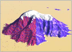 |
Altitude uses all of the colors you have chosen, but in addition, it puts white at the high altitudes, and yellow at the lowest ones. (You can control the snow line by scaling the texture in the Material Lab.)
(I'm showing you these on rendered mountains, because, unlike the others, you can't really see what they do in the DTE swatches.)
| Spline with Snow |
 |
Spline with Snow is just like Spline Interpol, but it adds white to the high altitudes.
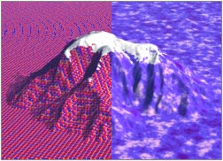
| Slope |
 |
Slope puts whatever color is in the top swatch on the flatter areas, and weights the others so the color in the bottom swatch is much more prevalent in the really steep ones, and the middle color predominates in the areas that are in between. (I had to steepen up my mountain so you could even see this. Bryce really does mean steep when it says steep.)
| Orient |
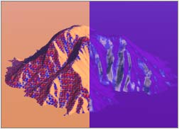 |
And, finally, Orient puts the color in the top swatch on the side of the object that faces West, skews the other colors towards the one in the bottom swatch and puts them on the side facing East, and arranges the color on the remaining sides to suit itself, depending on the shape of the object and the colors you have chosen. (The weighting gives exactly the same colors you find in Slope, by the way; they are just applied in a different direction.)
If you came here in the middle of the lesson, you can return to Page 2 now.