Note: I haven't used Bryce in years; so these tutorials are archived "as is." I can't accept questions, because I don't remember the answers.
This is page 2. If you haven't finished page 1, please do so before starting this page.
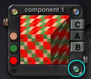
 We've been looking at the Noise Dialog; now we are going to look at the Noise Editor.
Click the green corner of the Noise Dialog to open the Noise Editor palette. Grab it in any blank area, and move it to the side so you can see the results of what you are doing in the Component Preview.
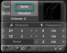
The first thing listed there is the type of noise. There are many different types that come with Bryce. All of them produce a different, and distinctive, pattern.
You can see what is available by clicking on the name of the current noise type (Spots, in this instance.) A list will drop down, that will allow you to choose the noise type you want.
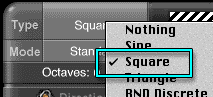 Nothing, of course, is nothing. But all the rest are something! Some, like sine, square, and triangle, are very regular. Others, like the Voronoi noises, are more organic. As you get used to using the DTE, you will get used to the various noise types, just as a painter gets used to the tools available, and knows when to use a round brush, and when to use a palette knife to get the effect she wants.
Try looking at a few. If you want a table showing all of the noise types, I have provided one. Be aware, though, that it's pretty large (after all, there are 49 different types of noise, and each is displayed at two frequencies for clarity.) So please be patient while it loads.
It's still faster than running through them all; but feel free to do some of that, as well. When you are finished, please set the Type to Square for the next bit.
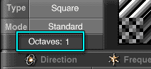 Skipping modes for just a moment, look below that, and you will see a place for Octaves. Right now, it is set at zero. Just like octaves increase the complexity and harmony in music, they increase the complexity in the noise used in Bryce. Set the Octaves to 1.
You will notice that there are now more squares in the pattern, and they are no longer a simple checkerboard.
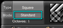 Go back to the Mode button. This determines how the octaves interact with each other.
Remember, we are dealing with noise here. Like music, noise is made up of waves. Each wave has a peak and a trough. The mode lets you determine how those waves are going to be combined to generate the new, more complex, noise.
You will notice that there's a Baker's Dozen of modes available. Feel free to explore them for a few minutes. Some have names that tell pretty plainly what they do, and some don't. I have a page listing all of the modes, and how they work, with examples of each one, if you want to go there.
I didn't include it here, in the main body of the lesson, because I don't expect you to remember all of that right now. But it's there for reference, or if you want to see it while you explore. I strongly recommend that you at least print it out, or copy it to your hard drive, or something; even if it looks too intimidating at the moment. You may want it later.
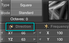 Ready? Good. The next two sections deal with the direction and frequency of the noise. They are a lot like the corresponding functions in the Material Editor, but this time you are working with the components of the texture. So you can have different components using different angles and frequencies, which is pretty powerful.
Return the noise to zero octaves and standard mode, just so you can see this.
Place your cursor directly on the little gold Direction icon, and move the mouse. As you can see, lines appear on the thumbnail, that show you the direction your texture is taking. You can also see the preview changing in the Component Preview window, so you can see exactly where things are going.
Notice that you can move both in the XY-direction, and in the YZ-direction at the same time.
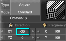 Now, put your cursor directly on the numbers, hold down the mouse button, and slide right and left. You will see the texture move in real time.
Notice that your movement is constrained to the direction you have chosen.
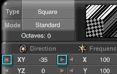 Finally, put your cursor over the arrows at the end of the number bars. If you hold down the mouse button, you will move through the numbers very quickly. But, if you click, you will move one at a time. This is very useful for fine adjustments. At the moment, there is still no way to simply type the number you want into those fields (at least, if there is, I haven't found it.)
If you hold down the Option/Alt key and click, all the numbers in the section (either Direction or Frequency) are set to the number you are working on.
Both Direction and Frequency work this way. Try them out.
When working with Frequency, the closer the numbers get to zero, the larger the texture appears, exactly like it is in the Editor in the Material Lab. The farther in either direction they get, the smaller the texture. Large negative numbers translate into textures that are just as small as large positive numbers.
Also, when working with Frequency, dragging on the little gold Frequency button causes all three axes to scale proportionally, just like the slider in the Noise Dialog; but you can see what the numbers are, so I like it much better.
 |
 |
 |
You can choose for the noise to be applied only in one dimension, which forms lines with all types of noise. In two dimensions, which will make patterns on two opposite surfaces of a cube and lines on the others, or in all three dimensions, which puts patterns on all sides. You do that by clicking in the 1D, 2D, or 3D hollows at the bottom of the box, of course.
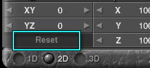 Finally, if you want to return to the way the noise was when you entered the editor, hit the Reset button at the bottom.
Set the noise to Square, Standard, one octave, both directions zero, all frequencies at 100, and 3D. (Or, if you haven't left the dialog since we came in here with the Basic Spots, just tap Reset, and then change to Square noise, 1 Octave, and click in the 3D hollow.)
To work with most of the rest of the DTE, you will have to close the Noise Editor. (In fact, the only parts you can touch without closing it seem to be the Dialogs. But you can work with all three of them; Noise, Filter, and Phase. You can even jump from the Noise Editor to the Phase Editor (which looks exactly like it, as we will see in a moment) by clicking the corner of the appropriate dialog. But, since there is absolutely no indicator to let you know which one you are using, I highly recommend not doing that. Close one before you open the other, and you will never get lost.)
Alright. Close the Noise Editor, and we'll move on to Phase.
 Phase, as I have mentioned, is simply displacement. Whatever noise you are using here warps your texture. You can warp it a little or a lot, depending on how high you set the Phase Amplitude.
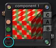
Click the glassy button in the lower right corner of the Component palette, or the Phase button at the bottom of the DTE, to open the Phase dialog.
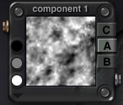
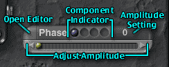 Notice that, at the moment, it doesn't have a green corner. That is because phase isn't being used in this component. So sliding the slider won't have any effect. We are going to fix that.
Click on the corner anyway, and it will open the Phase Editor. You will notice that it looks a lot like the Noise Editor. There is a reason for that. It's exactly the same. Phase is also noise; but it's used to displace the component noise.
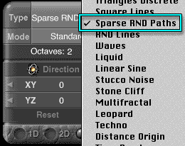 Set up a noise (you won't see any change while doing it, so don't worry.) Let's use Sparse RND Paths, Standard Mode, 2 Octaves, 3D. (Just leave the Direction and Frequency set to wherever you find them. You know how they work, and can set them later if you want to.)
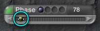 Then close the Phase Editor. Notice that the green corner of the Phase Dialog is lit up now. Phase is in use.
Slide the slider to the right to adjust the Amplitude.
 Notice that the nice neat squares are being warped and twisted. The more you increase the amplitude of the phase, the more the squares are displaced. Once again, you can slide the slider, or click and hold the arrows, or just click them. But it's very hard to move one number at a time. The best idea, I've found, is not to get too hung up on exact phase numbers. The differences are very small, anyway.
Once you have some phase set, you can go back into the Phase Editor, change the type of noise, etc. and see the changes happening in real time in the thumbnail. Play with it for a few moments to get a feel for it.
Now, of course, phase can make your texture very complex. And remember what happens when things get complex? The render time increases. If you decide not to use Phase after all, don't just turn it down to zero in the Phase Dialog. Remember to come in to the Phase Editor, too, and change the Type to Nothing. That will turn off the green corner, and Bryce won't look for the Phase. (As long as that is lit, Bryce looks, whether you are actually using it or not.)
 Which leaves Color and Filter. I'm saving Filter for last, so let's take a look at Color.
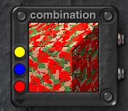
If you still have your Phase experiment up, save it as a preset if you are fond of it. (Click the Copper button on the Combination palette, or shift click the title bar there; then just save your preset as you normally would.) Once that is done, go back into the Phase Editor, and change the Phase Type to Nothing. (Or change it without saving, if you desire.) It will be easier to see the color combinations without it.
You can set the colors from the swatches just the way you would for any color swatch in Bryce. Hold down Option/Alt to get a more exact color picker, or Control+Option on a Mac or Ctrl+Alt on a PC to get your normal system color picker. Then just choose a color.
You may notice that the colors you choose aren't necessarily what you see in the window.
That's because there are lots of different ways to blend the colors.
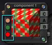
 Click on the flippy triangle directly under the Color swatches to see the available methods.
Once again, there is a detailed description of Color Blending modes on a different page. You can go there now, or wait until you actually want to look something up. (I'm trying to offer you all the material, but not get you so bogged down in choices that you miss the essential simplicity of using the DTE.)
For now, the important thing to remember is that the color is mapped to the Alpha channel. How that mapping works is, of course, determined by the Color Mode that you use. We'll be using some different ones in a bit.
| Alpha Channel | Linear Interpol3 Mode | Spline Interpol Mode |
 |
 |
 |
| Colors used are Black, 50% Gray, and White so you can see what the modes do. | ||
If you just want to use all three colors, and have them blend with each other in an intuitive fashion, the Mode you want is either Spline Interpol or Linear Interpol3. In both cases, the color in the top swatch is assigned to black, the one in the middle is assigned to 50% gray, and the one in the bottom swatch is assigned to white. They blend, of course, as the shades of back, white, and gray blend.
Spline Interpol favors the middle of the range, as you can see from the examples here. Linear Interpol3 is a straight linear interpolation (hence the name) so it's the truest to the shades found in the Alpha.
| Snow | Altitude | Slope | Orient | Altitude Filter |
 |
 |
 |
 |
 |
When you are looking at textures, whether they are ones that you make or things that you find on the internet or presets, they all have thumbnails.
With a little practice, you can learn to "read" the thumbnail on a flat plane; which is handy if you are looking at presets, or random combinations.
Snow is shown as a white corner in the upper left. If you see that, you are looking at a texture that will put snow on the upper altitudes. The larger that corner, the lower the snow will reach.
Altitude Color Mode has a white corner in the upper left, and a yellow bit in the lower left. (It's often pretty tiny; you have to look for it. If you try to use the texture, though, you won't be able to miss the yellow at ground level. If you don't want it there, just change the color mode to Snow.)
Slope has a band of solid color on the left of the thumbnail.
Orient has the solid color on the right.
A band of color on the bottom shows a texture that responds to altitude. We're talking about the Altitude filter here, not the color mode. With the color mode, you always get yellow on the bottom, and white at the top; there is nothing you can do to control those two colors. With Altitude filter, you have complete control not only over the colors, but also over how far up the object the change in colors occurs. It's really handy, and it's coming up very soon.
If you see combinations of these things, say a texture that has predominantly one color on the right, with a white corner, you are looking at a texture that has both orientation and snow on the top.
See how it works? We'll be seeing lots more of it in just a little while.
If you are still with me, it's time to go on to Page 3, and take a look at filters. (This is where I can show you how to invert the Alpha channel, and get those reflections where you want them!)