Note: I haven't used Bryce in years; so these tutorials are archived "as is." I can't accept questions, because I don't remember the answers.
This week, we are going to cover the last few things about making models and setting them up, learn to make complex materials in the Material Lab, and explore rendering options.
We are going to do it by making a scene with a temple in front of a mountain. The time of day; midnight. The mood; magical. If you want to do this yourself, you'll need the file in Lesson6.sit or Lesson6.zip.
Shall we begin?
Start Bryce, if it's not already running, and open a new scene.
 Go to the Object Presets (triangle next to the Create palette title) and click on the Column in the Boolean Objects category. Hit Return to close the presets and create the column.
Create a torus, name it Header, and rotate it 90° on the X axis. (Just change the numbers in the Rotate field while you have the Attributes dialog open to name it.)
Resize it from the middle symmetrically so that it's a bit larger than the diameter of the column. (Hold down Option/Alt, and grab a corner control handle. Keep an eye on the shadow on the ground, and resize.)
Pull it above the column, and land it. Now duplicate it, and resize the duplicate so it's just a bit larger than the original. (Command/Ctrl-D, then Option/Alt grab a corner, and pull.)
Align all three objects on the X and Z axis. (Select them all, then use the Align tool on the Edit palette.)
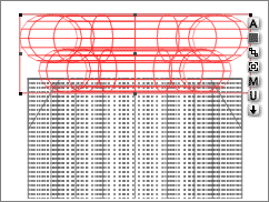
Switch to one of the side Orthogonal views, and set the two tori on the column so they make a double header. Hold down Option/Alt as you drag them to constrain the movement to the Y axis, remember. Overlap is fine, here.
Now, select the tori, and group them. Name the group "Header Group." Duplicate the group, name the duplicate "Footer Group," and go to the Resize Options triangle under the Resize Tool in the Edit palette. There are a few options there we haven't used yet.
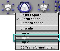 The one we are going to use now is "Flip Y." Click on it. The Footer group flips top to bottom, in exactly the same place.
 The Flip commands are all like this. They flip the object on the axis specified, without any reposition, so that you can make pairs of perfectly symmetrical objects, like the header and footer on this column, easily.
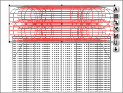
 Drag the footer to the foot of the column, remembering to constrain the movement to the Y axis. Rename the two tori there Footer and Footer 1. (You can do this without ungrouping by selecting them from the Selection palette, or holding Control on a Mac, or Shift/Ctrl on a PC, while clicking on them.)
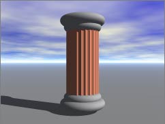
Render. You should have a very squat, oddly colored column.
Group all the parts, and name the group Column Group.
 We want the columns to be a lovely white marble, with golden threads. Doesn't that sound good?
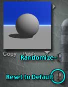
But first, let's get rid of the terra cotta. (If your group came into the Lab as the default gray, you can skip this step.) On the left side of the palette are two buttons that look like they should be on a watch or something. Click on the lower one, and your material is reset to the default gray. (The top one makes a random material. You can play with it later, if you want. I find it about as useful as the Random Sky button. Weird R Us.)
 Now, click in the A component column of the Diffuse and Ambient color categories. A random Component will appear. Hold down the shift key, and click the Texture Library triangle in the top right corner of the Component Palette to open the Library. Choose Volcano Lava from the Rocks category.
 Click on the Pinkish button to open the Texture Source Editor, and change the black color on Component 1 to white, and the red color to a dark gold. (Click on the round color swatch, and go from there. Remember, you can get the advanced color picker by holding down Option/Alt when you click. If you are more comfortable with your system's color picker, you can have that, too. Just hold down Control/Option and click on a Mac, or Ctrl/Alt and click on a PC.)
 Click the checkmark to close the editor. Now take a look in the Preview. Zoom in, and look at all sides of the sphere that is there. You will notice that the yellow veins appear only on the top and bottom. (This is even more apparent if you use a Box or Cylinder for the preview. You change it by using the flippy under the Preview window, remember.)
If you look at the thumbnails in the Component palette, you will see that the yellow veins are only on the left side. That shows that a filter has probably been used in the Deep Texture editor, so that the veins will only show up at certain elevations, or angles, or something. We can fix that, so they are everywhere, and it's very simple to do.
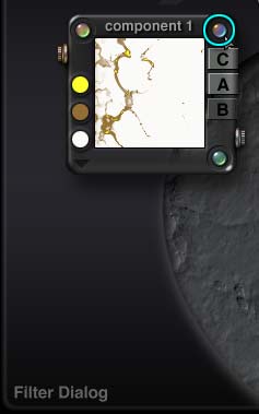 Go back into the Deep Texture Editor (pink button, remember?) and look at the Component 1 palette. There are buttons in three of the corners. If you run your cursor over the button in the top right corner, the text area in the lower left corner of the editor will say Filter Dialog. If you click on it, a new palette will open. Click on it now.
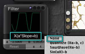 This palette is titled Filter, and shows a graph, with an equation under it. All textures in Bryce are really noise, remember. That equation is telling Bryce to filter the noise, so it only affects the material under certain conditions. But we don't want that. Click on the equation, and a pop-up menu will open with a list of the available equations. Heading the list is None. That's what we want. Choose it.
The yellow veins spread to cover the whole preview in the Component 1 palette. Perfect. Click the checkmark to close the editor and return to the Material Lab. Notice that the veins now cover the entire sphere.
 So far, so good. But we don't want just yellow; we want gold. In order to have that, we have to make it reflective, and so on. And we easily can. If you look at the three thumbnails in the Component palette, you will see that the first one is in color. That's the color part of the component. The second two are in grayscale. The one in the middle is the Alpha; it controls all the value and optics channels except for Bump. White pixels in are treated as 100% of whatever it is, and black are treated as 0%. The shades in between, of course, are values in between. (The exception, of course, is Transparency. The darker a pixel, the more transparent, as you already know.)
The last thumbnail is the bump. It works exactly like bump maps that you have already applied to materials using Images.
In this case, you will notice that there is no bump. Hmm. It would be nice to have a slight indentation where the veins are, wouldn't it? Let's fix that. Click on the pinkish button to enter the Deep Texture Editor again.
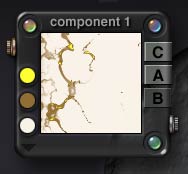
 This time, notice that there are three letters on the right side of the Component palettes. They are C, A, and B and stand for Color, Alpha, and Bump, exactly like the thumbnails. As you can see, C and A are lighter than B. The bump for this component hasn't been enabled. But all you have to do is click on the B to enable it! Do that now. Wow! Some difference. Well, that's the Bump at 100%, and we don't need to use that much of it. Click the checkmark, and go back to the Material Lab. Notice that there is now a grayscale picture in the third thumbnail, as well.
 Alright. We want the Alpha used in the Metallicity channel, because it will filter the reflections through the Diffuse color, and make it look more metallic. Click the dimple to put a blue button in the A column, and drag the slider to 100%. We also want it in the Reflection channel in the Optics portion of the palette, so click there as well. That makes the veins dark, because although the program now knows where to put reflections, they are still set at zero. Drag the slider to 100% here, too, to brighten them up.
We want to use the Bump part of component A in the Bump channel, so click there, too. Then drag the amount of bump up just a bit. (I'm using 3, but what you use is up to you.)
Now, this is marble, so it should be shiny. Remember how to use Specular and Specular Halo colors from the second lesson? Set the Specular color at white, the Specular Halo at dark gray, because this is a hard material, and the Specularity value somewhere in the high 90s.
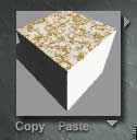
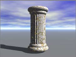 That's it. Leave the Editor, and render your column. Pretty, huh? The reflections may turn out to be a bit high, and the material size may need changing, but those are so minor.
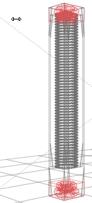 We do need to resize the column, though. This isn't at all the slender things I imagined. So, make sure it's selected, and use the Edit tool to make it smaller in all dimensions. That will keep it symmetrical on the X and Z axis. Keep going until it looks like the diameter is about right for a slender column. Then, grab the Y control handle, and pull it up to match its footprint.
Oh my! The headers and footers are now great bulbous things, aren't they? That's not right. But it can be changed, without ungrouping the column. Put your mouse cursor on the header, hold down the Command key and click on the Mac, or Shift/Ctrl click on the PC, to select just the named Header Group. Then, move to the footer, hold down the Shift key, and repeat to select just the Footer Group, as we have done before.
Now you can resize them. Grab the top Y control handle, and smoosh them down until the proportions look right. Notice that they seem to be resizing independently. They are. Whenever you resize, rotate, or reposition multiple objects they each rotate etc. from their own center, unless you are acting on a group. In this case, although both the header and footer are members of the Column Group, we weren't resizing the group, just the two pieces, so that's how they moved. Remember that. If you need two (or more) things to maintain their relationships to each other while resizing, etc., put them in a temporary group first.
 Alright. Select just the Column, and stretch it down into the Footer Group. You can check in the Orthogonal side view to make sure it's reaching. (The flutes are longer than the central cylinder, so it can be tricky. Select just Cylinder 1 to see where it actually ends.)
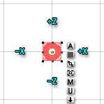 Now we need to make a ring of these columns, to form the basis of the temple. Switch to the Top orthogonal view, select the whole column, and open the Attributes dialog. Enable Show Origin Handle.
While you have this dialog open, lets make things easy. We are going to center the column on the X and Z axis. Type 0 into the Position text fields there, and close the dialog. The column is centered.
From here, all positive values on the Z axis are straight up, negative ones are straight down, positive X values are to the right, and negative ones are to the left. It's much easier to work with models when they are positioned at the center like this, as I'm sure you can easily see.
 We are going to put 12 columns in a circle. I'm choosing 12 because it divides so neatly into 360 (fancy that.) And I'd like it to be 60 Bryce Units in diameter. In this view, you can see the grid of the ground plane easily. Each of those grid squares is about 20 B, if you haven't resized it at all. We need to move the origin handle to what will be the center of the circle. So, hold down the z key to constrain the motion, and just drag the little green Origin Handle out about one and a half grid lines along the positive Z axis. (The green spot will disappear when you constrain it, and you will have to watch the end of the red line, instead.)
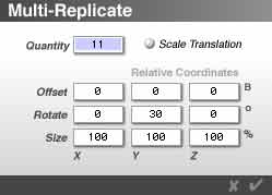 We are ready to make our column ring. With the Column Group still selected, hit Option-Shift-D on the Mac or Alt-Shift-D on the PC. The Multi-Replicate dialog box will appear. (You can also just choose it from the Edit menu, but if you can learn the keyboard shortcuts, it will cut your production time considerably later on.)
We want 12 columns, and we have one, so we need 11 copies. Enter that number for Quantity.
We don't want them repositioned, so make sure the Offset is zero on all axis. We don't want them resized, either, so make sure those all say 100%. But we do want them to be rotated around the origin point. The extra copies will form a circle looking at them from above, so we want the rotation to take place on the Y axis. We need 12 copies all together, and if you divide the 360° in a full circle by 12, you get 30. So each copy needs to be rotated 30° on the Y axis. Type it in, and click the checkmark or hit Enter.
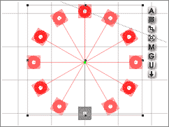 The computer will think for a moment, and then you will have a perfect column ring. Notice how all the origin points meet in the center.
 Obviously, these need to be grouped. But they are complex enough that they will take a while to redraw every time. So, while the eleven new ones are still selected, select the first one as well, and group them.
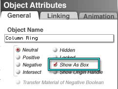
Open the Attributes, name them something like Column Ring, and then, in the choices on the right, click Show as Box. In the wireframe, the wireframes for all those columns will be replaced by a single box, which is much easier to draw. Anytime you want to see the actual shapes, you can toggle Show as Box on and off; but in the meantime, we know where they are, and they aren't costing processor time. Best of all, the long list of parts that compose the members of this group vanish from the selection menus, making it much easier to select other things. (They will reappear if Show as Box is disabled.)
Notice that the actual columns are still shown in the Nano-preview.
While this dialog is open, change the position to zero on the X and Z axis to center the group.
 Alright, we need a platform for these columns to sit on. Let's make some steps.
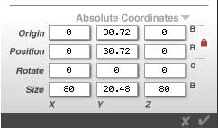
Create a cylinder, and open the attributes for it. Name it something like Step. Type 0 for the Position on the X and Z axis to center it. We need to resize it on those two axis, as well. We know the diameter of the ring is 60 B, and the columns are centered on it; so it's actually about 68B. Let's make the step 80 B in diameter, to give it room. Change the size values to 80 on the X and Z axis, and close the dialog.
 Pull the step down below the columns (or the column ring up above the step, whichever will put them both above ground level) and smoosh it down on the Y axis so it looks about right. Check the attributes to see what you choose (it'll be the value in the Size Y field.) In my case, it was 3.5 B.
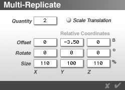
Now, open Multi-Replicate again (Shift-Option-D or Shift-Alt-D.) We will need three steps, and they should (obviously) stair step. So, that's two in Quantity. No rotation, but they need to be offset in a negative direction the same height as that first step. For me, that's an offset of -3.5 on the Y axis. For you, it's an offset of whatever the height of your step is.
They need to be resized, too. So, let's size them 110% on the X and Z axis. Leave the Y axis at 100%, so the height won't change. (Remember, that number is the actual percentage of the original size, not what percentage you want the size to change. If you don't want any change, it has to say 100. If you type in 0, because you want no change, you will get a 2-D object.)
Click the arrow, and there they are!
 Before you group them, copy the top step. We are going to use it for the roof, as well. Then select and group all three of them. Name the group, and land it. Then select the Ring and land that, too.
Paste the step you copied into the document, and drag it up, constraining the motion on the Y axis, above the Ring. Land it. Rename it Ceiling or something like that, and set the Boolean attribute to Positive, because we are going to be using that later.
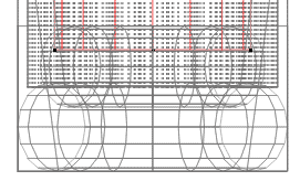
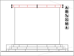
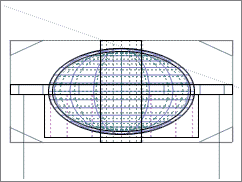
If you look from one of the Orthogonal Views, your scene should look something like this. (I'm using white background paper, by the way, to make the .gif files smaller. Just pretend there is a graph under it.)
 Most of the next bit will be done in Orthogonal Views, so you may want to switch the Nano-Preview to Camera view, so you can keep an eye on what is actually happening. You may also want to pull your camera back, so you can see more of what is going on.
I suggest that you use the Z branch of the Camera Cross, instead of just changing the Field of View or using the zoom tool, to prevent fisheye lens distortions in your picture.
 Now create a sphere, name it Dome, center it, give it a positive Boolean, and resize it so it looks right for the dome on top of the temple. (Keep an eye on the Nano-Preview while you do this, of course.) It should be flattened, and the center should be about at the center of the Ceiling. You can eyeball it in an orthogonal view for that, or you can just check the Attributes, and put them in the same place on the Y axis. (You can also lock the ceiling, and align them; but that is more work.)
Do check it in an orthogonal view, though, to make sure that the proportions are right. There is too much distortion in the perspective views to be certain.
Duplicate the dome, and shrink it from the center. It's going to be the negative boolean, so name it something like Dome Shell and give it a negative boolean.
Duplicate the Ceiling, and move it down so it just touches the bottom of the first piece. (The easiest way, of course, is to do a bit of math in the Attributes box. Subtract the height of the ceiling, which is right there in the Y size text field, from the Y axis.) Give it a negative boolean, too, and resize it so that it just covers the dome. You can stretch it on the Y axis easily.
The easiest way I know to do the other two dimensions and keep it all symmetrical is to hold down Option/Alt, grab the control handle that is on the side from your angle, Z in my case, since I'm using the Right Orthogonal view, and just drag until it fits. Then copy and paste that value into the X axis text field in the Attributes dialog.
Create a cylinder to be the hole in the center of the roof, name it, center it, and give it a negative boolean too. Align all the roof parts on the X and Z axis, group them, and it's ready to roll. Name it Roof.
( I put the parts in different families so you would be able to see more easily what is going on here. You don't have to do that. I also added the black lines in Photoshop, to distinguish between the parts. You won't see them on your screen, but I thought they might help.)
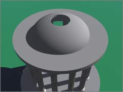 Your roof should look something like this. (Shot taken with the Director's camera. I added the green to the ground plane for clarity.)
 Select the Ring, and take it into the material editor. You can still do that, even though it's being shown as a box. Copy the material, using the commands under the preview. (I'm going to turn down the reflections, too. They are too bright for my taste.)
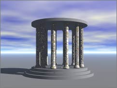
Select the Steps and Roof, and paste the material. Render. How does it look, so far?
We need to put some things in it, though. We'll start that on Page 2.