Note: I haven't used Bryce in years; so these tutorials are archived "as is." I can't accept questions, because I don't remember the answers.
This is page 3. If you haven't finished page 2, please do so before starting this page.
 Alright! We are ready to take a look at filters.
This is, in my opinion, perhaps the strongest and most powerful part of the whole DTE. Filters can change everything.
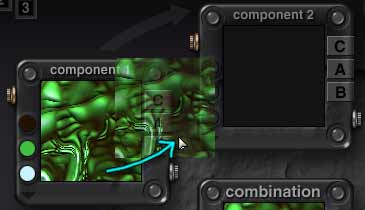
Load the Basic Spots texture again. (Go into the DTE if you are not already there, and click on the title of the Combination palette. Choose Basic > Basic spots from the drop down menu. (If the Installed menus aren't showing, you have been working in the User menus. You will have to hold down the Shift key while you click on the title bar, and choose from the thumbnails instead.))
Switch to Flat Plane preview if you are in either of the others by clicking on the picture of the flat plane in the upper right hand corner of the DTE.
Open the filter dialog, if it isn't already open, using either the Glassy button in the upper right corner of the component palette, or the Filter button at the bottom of the DTE.
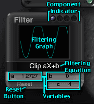 You will notice right away that this dialog doesn't look like the others.
It still has a place for the blue spheres which indicate what component you are working on, but it also has what looks like an oscilloscope screen, a mathematical equation, three letters with numbers after them, and a reset button. There is nothing to get to an editor, because this is the editor.
The screen shows the wave form of the filter. The equation is exactly that, and the numbers are the variables that are used in the equation. (But you don't have to worry if you aren't a fan of Math, because this can all be done by dragging the graph without even looking at those numbers. (Well, except for c, which you do have to set yourself for the two filters that use it; but it's not math, just counting.) The Equations all have names, too, and they are easy to remember. I promise; you won't have to do any math. The computer will do all the math for you.)
 |
 |
Those variables control the shape of the wave for each equation. The top of the graph represents lighter values, the bottom is darker values. The flat places at the top and bottom are the parts which are clipped to give either pure white, or pure black, in the Alpha channel. The steeper the wave, the higher the contrast. The shallower it is, the lower the contrast. And you can control every bit of it by simply dragging on the numbers, or on the Filtering Graph itself.
 |
 |
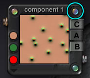
Lets take a look at that. Go to the CAB buttons in the Component palette. Click the A to turn on the Alpha, and click the C and B to turn them off.
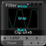
Now, place your cursor in the middle of the graph, hold down the mouse button, and drag slowly upwards. As you do, notice that the wave moves up, the numbers increase for b, and the colors in the thumbnail get lighter. When it gets too high, it becomes flat, or clipped. The colors can't get any whiter than white. Hit Command/Ctrl Z to undo.
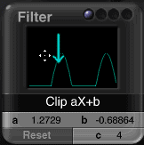 |
 |
Drag the other way, and you will see the wave go down, the b numbers decrease, and the colors get darker. Once again, it's clipped at the bottom. Undo.
 |
 |
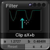
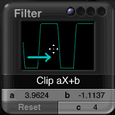
Now, place your cursor on the graph again, but this time hold and drag to the right. The graph becomes more extreme, with the top and bottom getting clipped., The value of a increases, and the contrast in the thumbnail increases.
 |
 |
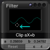
Switch, and drag to the left. The graph levels out, the a numbers decrease, and the contrast also decreases.
 |
 |
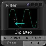
Keep dragging far enough to the left, and the graph will turn into a flat line, and then "flip over." This inverts the Alpha channel!
The spots, which were white, will become black, and the background, which was black, will become white. If you drag up a tiny bit at the same time, you can end up with a graph that looks a lot like it did when you first started; but with the shades in the Alpha are reversed. (If you click on the color button now, by the way, you can clearly see how the color is mapped to the alpha value. The background will now be red, with tiny green spots that have a beige center.)
So, if you ever wanted to invert the alpha of a texture, this is one way to do it. Just flip, and work with the graph until it's a mirror image of the one that it had. (If you open it and find it's not using a filter, add Clip aX+b, but don't actually clip anything. It will look a lot like none, but you will be able to flip it. Also, make sure that the filter you need to flip isn't on the Combination.)
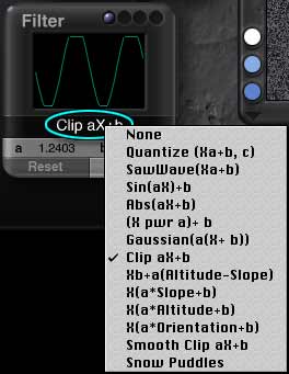 If you click on the Equation, you will see a whole list of filter types. Some of them, like Altitude and Slope, are pretty obvious. Others are more obscure. If you want to go right now and look at a detailed discussion of each filter type, you can. If, on the other hand, you want to wait until later for that, that's alright too. Once again, I'm not asking you to memorize all of it. It's much more important to understand how you can change the filters, flip them, and increase and decrease the contrast.
But I do highly recommend that you look over the various filter types at some point; and certainly print it all out so that you have it for reference.
 Okay! You still with me? Good.
Now for the fun part. All of the stuff we have been looking at so far can be assigned to each of the three components. And those components can go together in different ways.
Those ways are the Blending Modes.
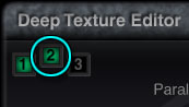
Click on the 2 in the upper left hand corner of the DTE to activate the second Component palette. If you haven't been working in it at all with this texture, a random one will be assigned. (If you have, whatever you were playing with will be back, which can be very convenient.)
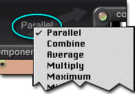 You will notice that the arrow that goes from the first component palette to the second now has a word on it. Click on that word, and you will be able to choose a Blending Modes.
Once again, I've prepared an appendix with the details of all the Component Blending Modes, since after all there are 19 of them. But I do want to mention a couple of very important things about them here.
| The first two components are combined, and the result is combined with the third. The same components, in different orders, give very different results. |
||||||||
| Component 1 | + | Component 2 | = | Combination | + | Component 3 | = | Combination |
 |
Combine |  |
= |  |
Blend v1 |  |
= |  |
|
Combine | |
= |  |
Blend v1 | |
= |  |
It's important, when you are setting up your textures, to realize that the placement of the components is often vitally important. (That's why the Blending Arrows are arrows.)
As I'm sure you realize, behind the scenes all of the work in Bryce is done with calculations. When Bryce performs the calculations that yield a texture, it first looks at Component 1 and then combines it with Component 2 using whatever Blending method you have specified. It then takes that result and combines it with Component 3, once again using the specified blending method, to arrive at the Combined texture. If you like mathematical formulas, the formula it uses is (C1+C2)+C3=Combination.
In addition, many of the Blending Modes themselves take things from the components depending on the order they are in. For instance, Combine mode (used in the example above) replaces the color in the top color swatch of the second component with the colors from the first component, and uses the Alpha and Bump from the first unchanged, if they are enabled. Or Blend v1, (also used above) which uses the Alpha channel from the first texture as a mask to blend the two colors. Lots of them are like this. So be aware of it.
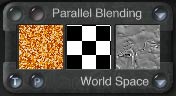
| Parallel Blending | ||
 |
 |
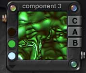 |
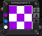
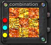
| Color from here | Alpha from here | Bump from here |
 |
 |
Color from 1, Alpha from 2, Bump from 3. |
| Gets this Texture | Which can look like this rendered! | |
| Channels that are used in the first component are unaffected by the second component.
So, the first component has only color, which is used. The second has color which is ignored, and Alpha, which is used. The third has Color and Alpha, which are both ignored, and Bump, which is used. |
||
Have you ever looked at a texture in the Material Lab, and noticed that the Alpha and Bump didn't seem to have anything to do with the Color? Ever wanted to fix that? Ever wanted to make one like that yourself?
Well, it's easy. When that happens, all it means is that the texture is using a Parallel blending mode. In Parallel blending, the first Component is examined by Bryce first. Any channel that it is using passed to the next calculation unaltered. But any that it is not using is taken from the second Component.
Those unaltered channels can be altered by the third component, or by anything that is done to the Combination. But if all three use Parallel blending, and the Combination isn't using any effects, then you can fill your three channels with totally unrelated textures.
In other words, if there are three components being used, and the Blending Arrows between all three say Parallel, then any channels not used in the first one are taken from the second, and any not used in either of the first two are supplied from the third. If you enabled only Color in the first, only Alpha in the third, and only Bump in the second the combined texture, which would show up in the Combination Palette and in the Material Lab, would have the Color, Alpha, and Bump coming from three entirely different textures. Which is a great way to get interesting effects.
The second important thing is that a lot of the Blending Modes have names that will seem familiar to you if you use Adobe Photoshop. Those modes do pretty much the same things here. So, you see, you know more about it than you thought you did!
| Color Mode; Linear Interpol3 | When a color mode other than None is used, the Alpha of the Combination is used to blend the colors in the Color Palette there with the other colors in the Combination, according to the Color Mode chosen. |
 |
Now, once you have all your components lined up, and all blended the way you want them, guess what? You guessed it! You can play with the Combination Palette in many of the same ways!
Basically, the Combination is the result of a bunch of calculations. Those calculations yield a texture with the channels that were present in any of the components. When you play with the Combination palette, you are adjusting that calculated texture.
You can adjust the frequency using the Noise dialog. (Not the editor. You just slide the slider in the dialog. The editor won't open if you click on the green corner when the ball is in the fourth hollow, because the Noise has already been calculated.)
You can also add Phase to it, or use a Filter just as you would for a single component.
And you can use the colors in the Combination's Color Palette, and blend them using any of the Color Modes, just like you can for individual Components.
The colors you pick will be combined with the calculated color, according to the Alpha of the calculation. So in the example above, the alpha, which was the square pattern, will show. The color in the top swatch (red in this case) will be assigned to the black part of the Alpha, and the one in the bottom swatch (yellow) will be assigned to the white part. (There is no gray in this example, or it would have gotten the middle color.) These colors are mixed with the speckles that were the result of the calculation to give the final color of the texture.
As you can see, with all of that at your disposal, the possibilities for new textures are virtually endless.
Just a few more things about the mechanics of the DTE, and then we'll start to play with it.
 When you are working with several components, you may find yourself wanting to get a single component to be in more than one palette. I use this most often when switching the order of components (I use the third component palette as a holding area and shuffle them around) or when I want to combine different frequencies or directions of the same component.
If you ever want to do this, it's simple
You can drag the texture from one component window to another. Try it. Drag one of these into the third window. Drag both of them in! The new one will replace the old one. However, if you are a Bryce old timer, the days of being able to copy and paste components between textures are over. Sigh. Now, you have to copy the settings onto paper or something, and recreate it manually. (Write to Corel, everyone. Better yet, ask them to allow us to open two DTE windows at once!)
If you want to zoom in and see a closeup of your texture, click in the combination window. You won't see more of it, (in fact, you will actually see less, because it's cropped,) but it will be larger and easier to see. If you want to see it as a full screen, hold down the space bar while you click.
If you want to load a texture by name, click on the title of the combination palette. The regular menu (without thumbnails) will pop up. If you want the thumbnails, hold down the Shift key while you click.
You can move the three dialogs anywhere you want on your screen. The component palettes, however, and the DTE itself, are stuck.
Still with me? You should be familiar with the basic parts of the DTE by this time, even if you don't yet know instinctively what to reach for to get what result. So, lets make a few textures and put a little of this knowledge into practice.
(By the way, I don't expect you to remember any of the specifics about the menus at this point. It's all there for reference, for when you are working later, after you have gotten used to the DTE, and want to just go in and make what you want; not to fool around for hours trying to figure out how to make what you want. I'll walk through a few things here, to get you used to how the DTE is used. My main point is to show you that it's not scary, and you get the results you want more easily than you thought you could.)
Ready to make things? Let's go on to Page 4.